Topic 2 seven fundamentals
Typography is used to make the text more readable and visually appealing.
Good typography can help to create a sense of hierarchy, balance, and clarity in a design, and it can also be used to emphasize certain words or phrases.
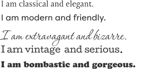
In fact, fonts have souls, personalities and tone of voices.
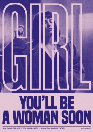
Fonts come in a variety of styles, each with its unique personality. Different fonts can evoke different emotions, and it is important to select the right font for the right occasion.
Serif fonts, for example, are often associated with tradition, sophistication, and elegance, while sans-serif fonts are often seen as modern and minimal.
Decorative fonts can also be used to create an eye-catching effect, while script fonts can be used to create a more romantic, handwritten feel.
Font psychology is an important consideration in graphic design, and understanding the personality of different fonts can help you create the perfect design for your project.
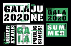
Grids are a structure for organizing elements in a design to create a sense of order and balance.
Grids can be used to determine the placement of elements, as well as the size and proportions of those elements.
They can also be used to create a visual hierarchy and guide the viewer’s eye.
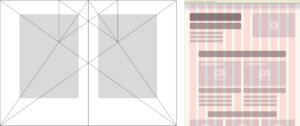
Grids were used since the Middle Ages to create an incredible visual harmony in books, thanks to the study and knowledge about nature’s geometry.
Nowadays graphic designers use grids to create more balanced and rhythmical elements.
I suggest you study the art of layout composing by:
- observing the work of famous graphic designers;
- reading a book, a magazine, or a brochure;
- studying big brands’ visual elements.
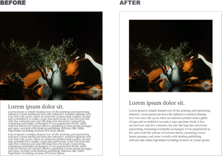
White space, also known as negative space, is an important element of graphic design.
It is the space between the elements of a design and helps to create balance, hierarchy, and focus.
White space can be used to create a sense of space and openness in a design by emphasizing certain elements in a design.
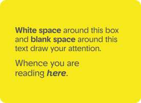
White space can be used to separate groups of elements, emphasize important elements, and create a certain aesthetic.
By using white space in a design, you can create a beautiful and engaging layout that is easy to read and comprehend.
Designing is about life. Your design must breathe.
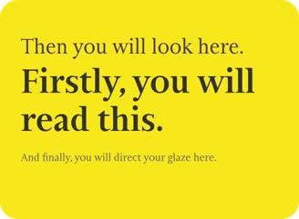
It is the arrangement of graphic elements in a design in order of importance of each element. By using principles like contrast, size, scale, balance, repetition, and brightness, designers can influence the order in which humans process information.
Visual hierarchy helps designers to create an intuitive experience, where people can quickly find the information they need.
The simplest way to create a visual hierarchy is to set up different sizes and colours for elements.
Colours may determine human emotions. Every colour is associated with different emotions, according to cultural behaviours. For this reason, we talk about the psychology of colours.
The use of colour in design can affect the emotions and moods of the people viewing those colour palettes.
Some colours are associated with precise concepts based on historical, geographical, and cultural heritage, as shown in the image on the side.
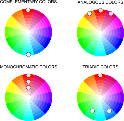
Colour theory is a set of principles about the use of colour in the design. It is based on how colours interact with each other, and how they can be used to create harmony in a design. Colour theory is used to create colour combinations that work together and create visual interest.

Complementary colours are colours that are directly opposite each other on the colour wheel. When used together, complementary colours create a strong contrast, which can be used to create visual interest and drama.
Analogous colours are colours that are next to each other on the colour wheel. They create a harmonious and balanced look, which is often used for calming and relaxing designs.
Monochromatic colors are colours that have the same hue but different values. Monochromatic colours create a harmonious and subtle look, as all the colours share the same hue but have different levels of lightness and darkness.
Triadic colours are colours that are evenly spaced around the colour wheel. They provide a vibrant, balanced, and dynamic look.
Geometric shapes like squares, triangles and circles have certain meanings that define graphic design.
Circles represent eternity because they have no beginning or end. They likewise represent free movement but are also widely used to protect and restrict.
Squares and rectangles mean stability, honesty, security, and equality, among other things. But because of their familiarity, they are not used to grab attention.
Triangles suggest movement, action, tension and aggression. They mean stability when standing on their base and instability when not.

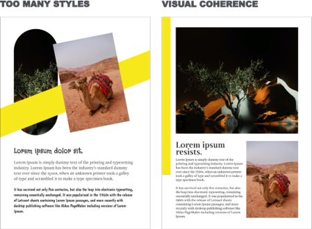
Visual consistency is essential when creating a cohesive and successful design. It is the thread that ties together elements in a single design, and ties together design across a single campaign or brand.
Consistency helps create a product that is distinguishable, usable, and effective.
To create visual consistency, use the same colours and hues, typography size and spacing, size and relationships of elements, space and how it’s used, visuals that cross mediums, user patterns that work naturally, and user interface elements that stick.